Quick summary ~~> In the last several years, we’ve seen a rapid shift in software and app interface design, from 3-D and skeuomorphic to flat and minimal. Although this trend has become nearly ubiquitous, let’s take a moment to consider how we got here and what influence it’s having on interface design as a whole.
In the last several years, we’ve seen a rapid shift in software and app interface design, from 3-D and skeuomorphic to flat and minimal. Although this trend has become nearly ubiquitous, let’s take a moment to consider how we got here and what influence it’s having on interface design as a whole. Additionally, I’ll share some tips and considerations on designing flat interfaces.
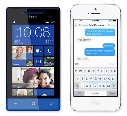
Interfaces on a Windows Phone 8 and Apple’s iOS 7.
What Happened?
So, how did the collective consciousness swing from a love of all things textured, beveled and drop-shadowed to a desire for flat colors and simple typography? Many factors have fuelled this transition, but here are a few that stand out.
INFORMATION OVERLOAD
As a constantly connected culture, we deal with a nonstop flow of information, some of it important and relevant, most of it not. We are constantly evaluating, filtering and, of course, creating content, and it all gets pretty exhausting. In addition, much of our content consumption has moved to devices with small screens, thus exacerbating that feeling of overload. Becoming overwhelmed is all too easy, and a reduction of clutter in a user interface (UI) can create a little visual zen.
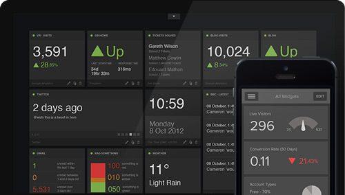
Free of clutter: Geckoboard’s visualisations are designed to make key data easy to interpret at a glance.
SIMPLICITY IS GOLDEN
In a similar trend, a lot of disruptive Web apps and services are offering highly focused tools with extremely limited feature sets. Whereas traditional software developers tend to load their products with a glut of features to justify the high price tags, this shift towards focused micro-apps favors simplicity over feature set. Simpler apps mean simpler interfaces.
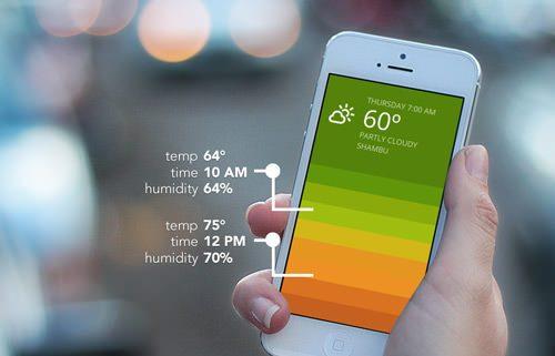
Beautiful and minimal: The Blue weather app by Oak.
CONTENT IS KING, AGAIN
As so often happens when new devices and technologies enter the market, we become fascinated by what they can do and how we can advance interactivity. This interface frenzy is usually followed by a return to a focus on content. Media consumption, whether of text, audio or video, is probably the activity we engage in most on our devices, and for that use case, we just want the interface to get out of the way.
TECHNOLOGICAL LITERACY
As smartphone and tablet adoption has rapidly penetrated all user demographics, concern about the obviousness of controls has reduced. Whereas we once feared that users might miss a button if it didn’t pop off the screen, we are now willing to explore subtler interactions. Windows 8 and Chrome for Android even support touch commands that start off screen, without any visual indicator.
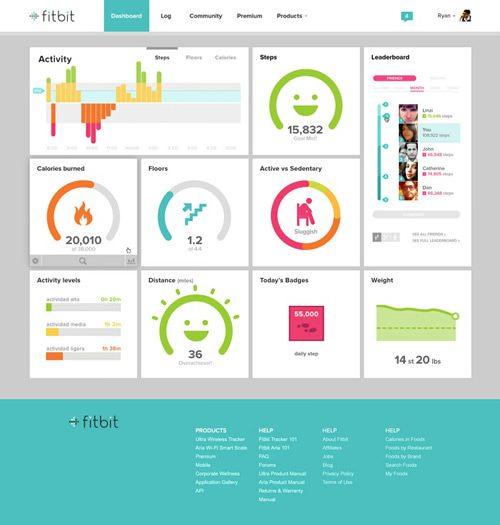
Fitbit’s dashboard is a bright, bold, and easy approachable visual identity.
TECHNOLOGY’S INFLUENCE
Most software will be limited by the platform on which it runs. Screen dimensions and pixel density are the confining factors of hardware. A minimal interface demands a very limited design palette, which means that every element needs to sing. Typographic scale and font weight will largely determine both the aesthetics and usability of a flat design.
If your target devices can’t handle that level of nuance, you’re out of luck. As screen size and pixel density continue to increase on mobile devices, thinner and smaller type can be presented with better clarity. Of course, support for @font-face has also boosted the appeal of minimal typographic-focused designs.
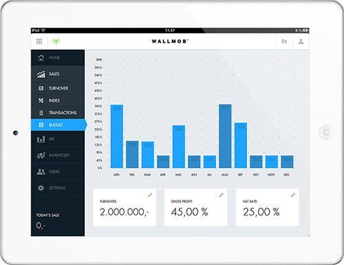
Live sales monitoring with Wallmob: keeping track of the figures from any device that has a browser.
RESPONSIVE DESIGN
With the proliferation of connected devices of various dimensions, UIs have had to become more fluid, and the responsive design movement has responded. While responsive design does not call for a particular aesthetic, one could certainly argue that flat UIs lend themselves to it more easily than many other styles. The other advantage of minimal design is the reduction in page weight and loading time.
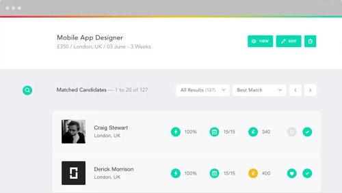
To the point and weightless
Best Practices
OK, enough with the theory. Let’s get down to some practical considerations. Creating an effective minimal design is surprisingly challenging. As you strip away common UI tricks (drop shadows, bevels, textures and the like), you quickly realize how important the few remaining elements become. While the following tips are mostly universally applicable, they are especially relevant to flat UIs.
BEFORE YOU BEGIN
As with any project, the first step is to ensure that your chosen style makes sense. Before diving into a flat design, make sure it aligns with your target users’ sensibilities and your target platform, devices and application type. Following a trend is pointless if it’s the wrong solution for your project.
PROCESS
The process you follow is pretty important, no matter what style you are adopting. Here are some ideas to keep in mind when aiming for simplicity.
- When designing a minimal interface, I often seek inspiration from the pre-PC era, when designers and artists did more with less. This is a perfect opportunity to revisit some of the design greats, such as Josef Müller-Brockmann and Wim Crouwel. I also look to minimal painters such as Ellsworth Kelly, architects such as Mies van der Rohe and industrial designers such as Dieter Rams.
- Walking away from the work is also helpful. Flat and minimal design is all about nuance. So, taking a break and coming back later with fresh eyes is often more effective than hammering away.
- Comparing versions side by side is also helpful. After moving a line of type up and down by 5 pixels for 20 minutes, I’ll save two versions and compare them; the better option is quickly revealed.
- Because the relative scale of objects plays such a critical role, check your design concepts on a variety of target devices early on to confirm that they work.
- As you work, keep asking yourself, “Do I really need that?” Getting attached to an item that you find clever is so easy, but we must always look for elements to cut or simplify. Ditching something that you’ve put so much work into is always hard, but editing is critical.

Global Closet: an interactive game designed for National Geographic Education by The Workshop.
GRID
The grid plays a crucial role in so much of interface design, and no exception here. As you attempt to establish order and make usability intuitive across a project with a restricted set of visual elements, the grid is there to help.
- The grid establishes more than visual order. Use it to define content and functional groups. You don’t always need a line or box to group a set of objects. Simple alignment and spacing can help the user understand an interface’s structure.
- Try breaking the grid with elements of particular importance to really draw the user’s attention. Without fake 3-D trickery, basic layout principles such as scale and placement become the best elements by which to establish visual hierarchy.
- Experiment with a denser grid than you are accustomed to working with. When you dramatically reduce the visual palette, you may find that the design supports a more complex structure without feeling messy. See what additional information you can convey through placement alone.
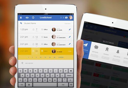
Live School iPad app by Rossul Design.
COLOR
Obviously, color is always a key component of visual design. With minimal interfaces, it is even more critical.
- Consider a broader palette.. If you’re like me, then you feel that a narrower palette usually leads to a more functional interface. Ending up with an overwhelming rainbow is all too easy. Here’s your chance to really stretch; and with so few elements to work with, you can feel good about expanding the palette.
- When setting the palette, test your selected hues across a wide value spectrum to make sure they behave in lighter and darker versions.
- You’ll probably want to experiment with tone on tone and stark type. Experiment with your palette early on to ensure that you have enough range for both subtle and high-contrast elements.
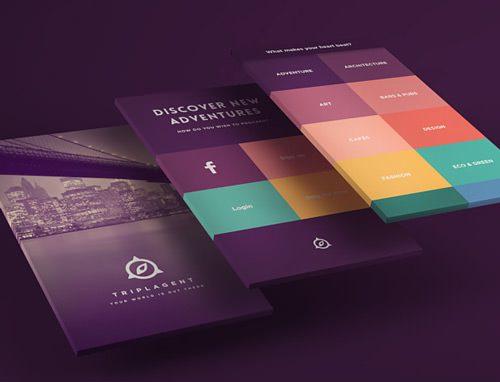
TriplAgent’s visual design makes use of a stunning color palette.
TYPOGRAPHY
When it comes to flat content-driven websites, typography is the hero.
- While serifs are certainly an option, san serifs almost always feel cleaner.
- Look for a font family with a wide variety of weights and styles. You certainly don’t need to use them all, but a broad selection will help you define the hierarchy more sharply, and you might also find that certain weights render better in certain environments.
- Don’t be afraid to pair fonts with extreme differences in size and weight to create visual order. Try pairing an oversized ultra-thin font for headlines with a small medium-weight font for the body.
- Watch out for legibility in fonts. It sounds silly, I know, but you will be asking a lot from your chosen fonts, so make sure they have great legibility at any scale.
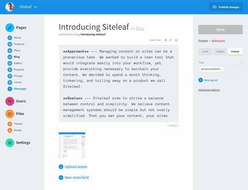
Clean and legible typography on Siteleaf.
INTERACTION
In a flat UI, indicating that an element is interactive can be tricky. Here are a few methods I rely on.
- Contrast is key.. If the majority of the layout is white, then you could give interactive elements some color. If the design is primarily text-driven, then you could use simple iconography. If the headlines are large and all lowercase, you could make links small and all uppercase. You get the idea.
- Conventional placement helps as well. If you use a slim chevron for a back arrow, place it in the upper-left corner, where users would expect to find the back button.
- As you layer more features on the page, making every interactive element look like a button wouldn’t make sense. The interface should be as intuitive as possible. But in cases where interaction is particularly complex or unexpected, make it easy to recover from mistakes.
- Drop-downs, modal windows, fly-outs and other layered elements can be troublesome to implement in a flat design. Leverage sharp contrast, borders or tinting to visually separate the levels of interaction.
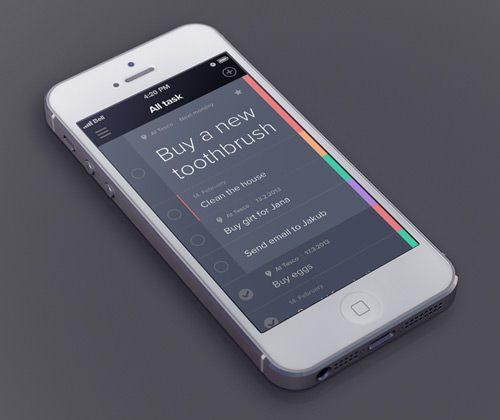
Design elements presented in a simple layout and with optimal contrasts
Wrapping Up
I don’t believe in hard and fast rules in design. Seeing designers so heavily invested in creating extremely clean and simple user interfaces is pretty awesome. Does exploring flat design mean using absolutely no gradients or shadows? Of course not. In fact, some of the most intriguing work I’ve seen recently balances flatness and dimension by presenting content intelligently while keeping the interaction intuitive.
In this highly connected, information-rich and feature-packed digital world we live in, minimal design’s widespread resurgence is refreshing to witness. It is by no means the right solution for everything (no style is), but when applied thoughtfully and appropriately, it makes for a highly usable and enjoyable digital experience.
Flat Design And Thin Is In