Whether you’re a student or a recent graduate, living on a tight budget means looking for savings wherever you can, including the assets for your creative projects. Of course, you don’t want to compromise on the quality of your work. That would be the very definition of a false economy. But the good news is, when it comes to fonts, you don’t have to!
Carefully curated by one the world’s biggest companies, Google Fonts is an oasis of high-quality digital typefaces. They’re all open source and available for free, forever. So if you can’t afford to licence commercial fonts, it’s a great place to find a no-cost alternative.
Read on as we bring you 10 free Google Fonts alternatives to the most popular commercial fonts, and explain what each has to offer the cash-strapped designer.
1. Roboto
Alternative to: Helvetica Neue
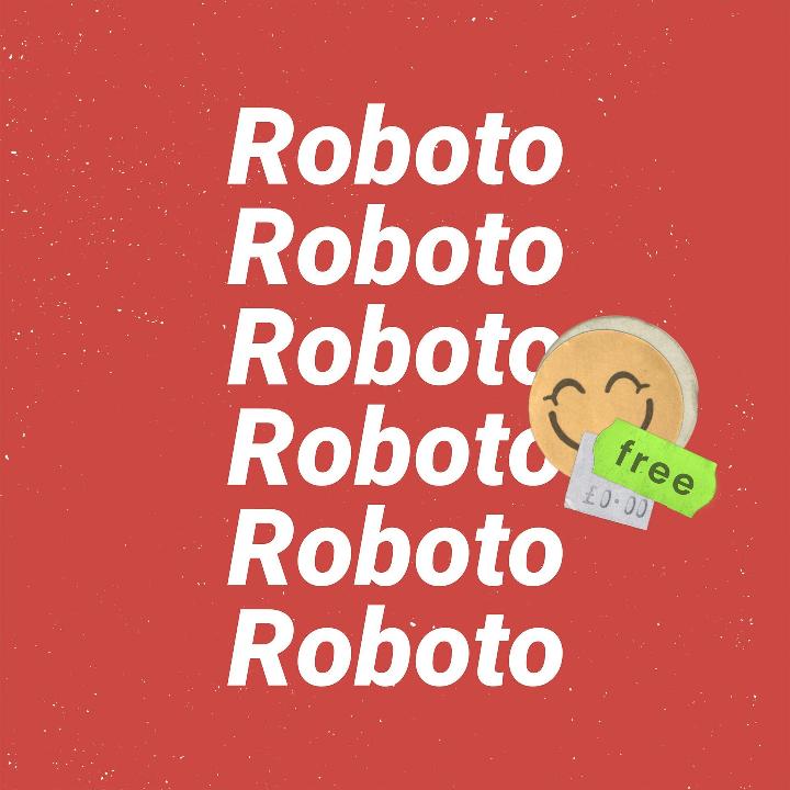
Designed in-house by Google’s Christian Robertson, Roboto is a neo-grotesque, sans-serif typeface family with somewhat of a dual nature. Its mechanical skeleton and largely geometric forms are balanced by friendly and open curves, and letters that settle naturally into their given width. Consequently, it’s a great font for instilling your body text with a natural reading rhythm.
2. Montserrat
Alternative to: Gotham, Proxima Nova
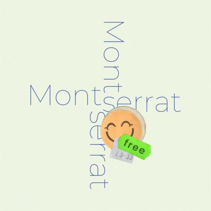
Argentinian designer Julieta Ulanovsky was inspired to create the original version of this font by signage in Montserrat, the oldest neighbourhood of Buenos Aires. In her words, her distinctive and evocative design encapsulated the “work, dedication, care, color, contrast, light and life, day and night” that typifies the people who live there. The classic typeface continues to be updated as part of the Google Fonts project and most recently, in 2017, it was redrawn by Jacques Le Bailly and Cyrillic support was added.
3. Lato
Alternative to: Avenir
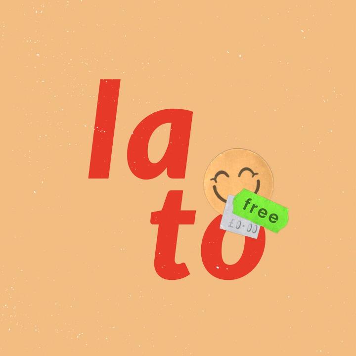
Lato (which means ‘summer’ in Polish) is a humanist sans-serif typeface designed by Łukasz Dziedzic. It was originally devised in 2010 as a set of corporate fonts. But, the client decided to go in different direction, so Dziedzic generously made the font available for free through Google Fonts. It cleverly combines classical proportions, which provide a sense of harmony and elegance. With a sleek sans serif look that still looks remarkably on-trend, a decade after it was first created.
4. Source Serif Pro
Alternative to: Charter
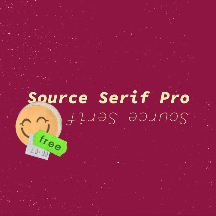
One of Adobe’s impressively long line of high-quality free typefaces, Source Serif Pro boasts simplified and highly readable letter shapes that are perfect for digital screens. As well as this, it is loosely based on the work of Pierre Simon Fournier, a French type-founder from the 18th century. This new version by Frank Grießhammer takes the idiosyncrasies Fournier was famed for and reworks them significantly for a modern age.
5. Zilla Slab
Alternative to: Museo Slab
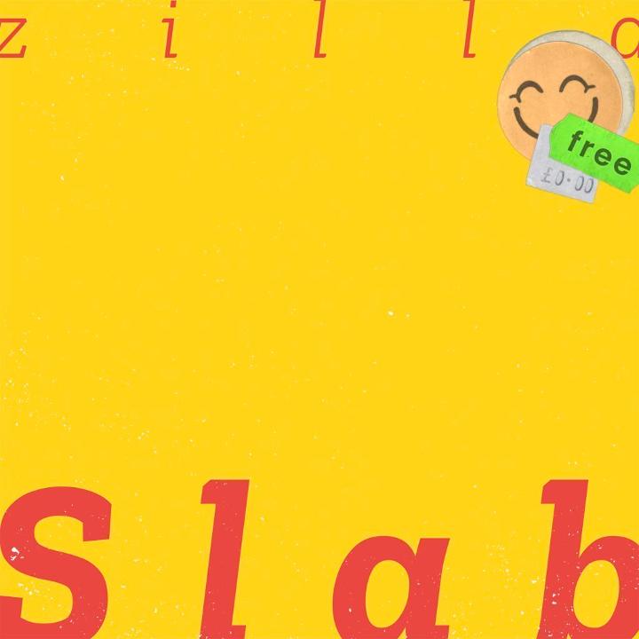
Created by Typotheque, Zilla Slab is the core typeface of Mozilla. Who you may know as the organisation behind the open-source web browser Firefox. A modern slab serif font based on Typotheque’s own Tesla. Its smooth curves and true italics combine to evoke a sophisticated version of an industrial look, with a friendly approachability nonetheless.
6. Arsenal
Alternative to: Optima
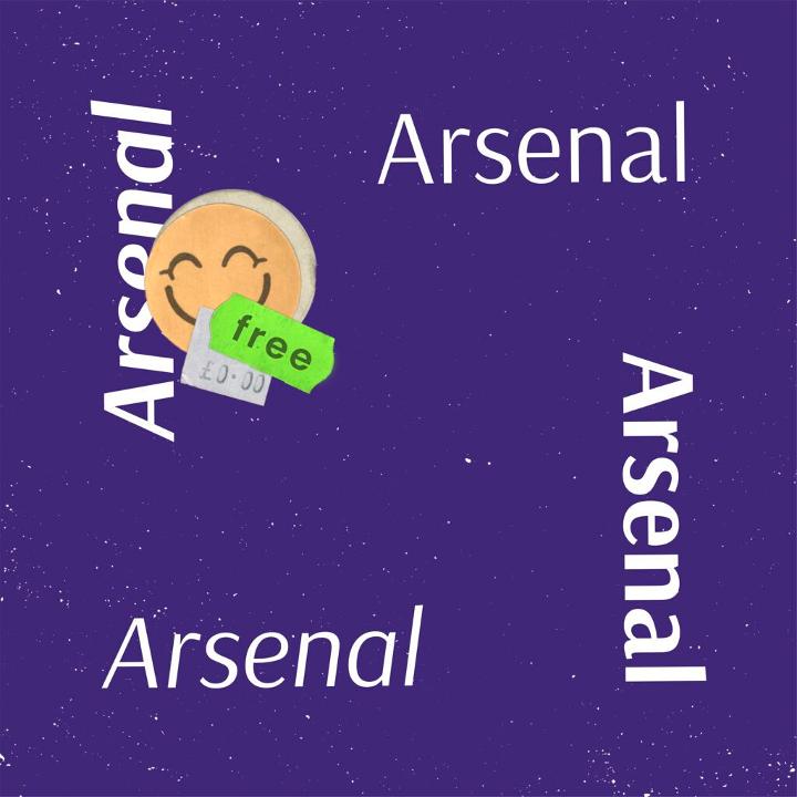
This award-winning typeface was created by Ukrainian designer Andrij Shevchenko. Arsenal is mainly intended for body text and professional visual communications. A semi-grotesque with traditional forms, it’s neutral, clear and somewhat lyrical. It is ideal for economical typesetting because of its narrow proportions.
7. Rubik
Alternative to: Block Berthold
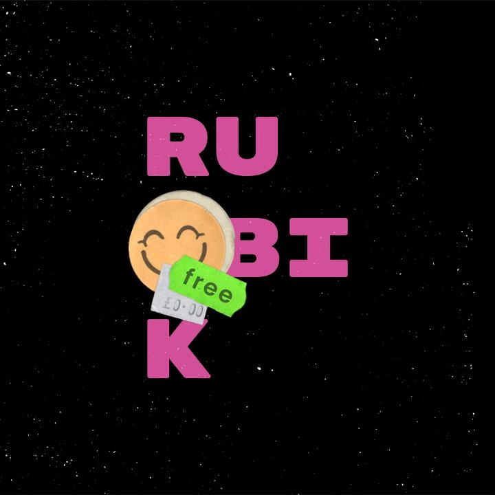
Rubik is a sans serif font family with slightly rounded corners, stout proportions and low-stroke contrast. It was designed by Philipp Hubert and Sebastian Fischer for use in a Rubik’s Cube exhibition, commissioned by Google. It would be a good choice for display text because it is a five-weight family with Roman and Italic styles.
8. Libre Franklin
Alternative to: Franklin Gothic
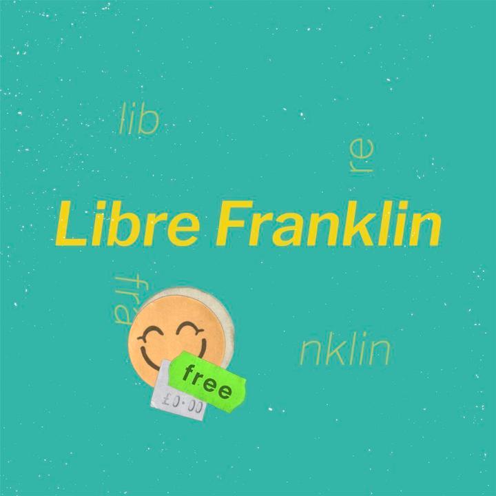
Libre Franklin is an interpretation and expansion of the classic 1912 typeface Franklin Gothic by Morris Fuller Benton. Presently led by Argentinian type design foundry Impallari Type. The new version expands the original typeface into nine weights. Similarly each has matching italics. Because of this it is a good choice for headlines and advertisements.
9. Josefin Sans
Alternative to: Brandon Grotesque
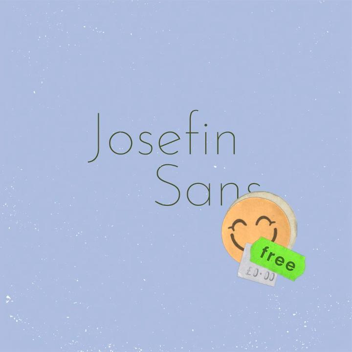
Designed by Santiago Orozco, Josefin Sans is an elegant, geometric and vintage typeface that works equally well at larger sizes. Inspired by the geometric sans serifs of the 1920s, it has an unusual and distinctive look because the x-height is halfway from baseline to cap height. Additionally in December 2019, it was also updated to work as a variable font.
10. Poppins
Alternative to: Sofia Pro
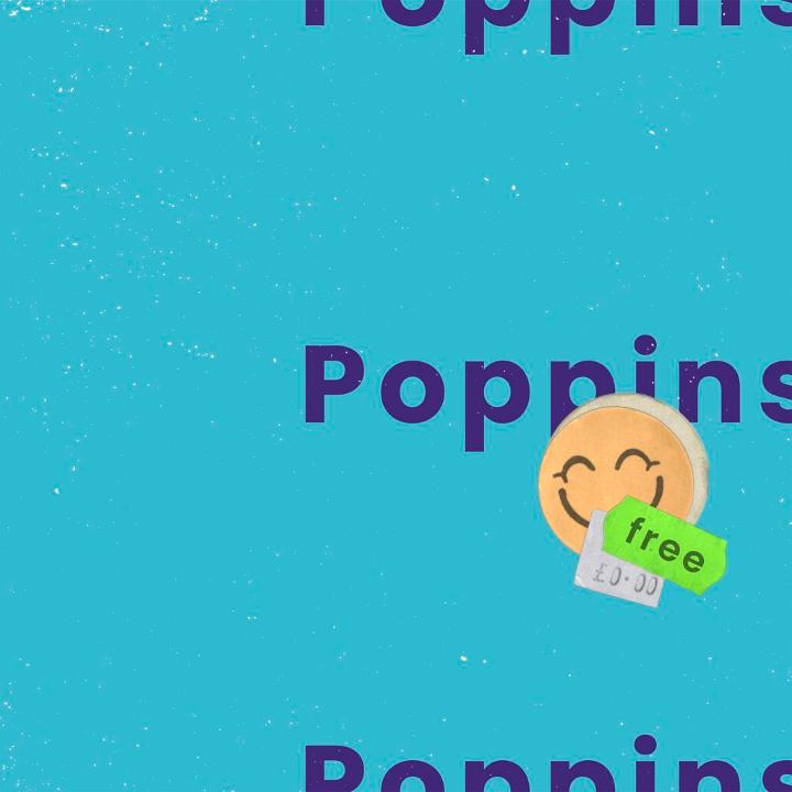
Created by the Indian Type Foundry, Poppins is an internationalist take on a geometric sans serif, with support for the Devanagari and Latin writing systems. Moreover, it’s based strongly on circular forms. As a result, each letter is nearly mono-linear, coupled with optical corrections applied to stroke joints where necessary. It’s available in nine weights with matching italics.
Check out our website and blogs to get more interesting Graphic Design topic.
10 Free Google Font Alternatives to Popular Fonts