Quick summary ~~> The recently popularized “flat” interface style is not merely a trend. It is the manifestation of a desire for greater authenticity in design, a desire to curb visual excess and eliminate the fake and the superfluous.
The recently popularized flat interface style is not merely a trend. It is the manifestation of a desire for greater authenticity in design, a desire to curb visual excess and eliminate the fake and the superfluous.
In creating new opportunities, technological progress sometimes leads to areas of excess. In the 19th century, mechanized mass production allowed for ornaments to be stamped out quickly and cheaply, leading to goods overdecorated with ornament. A similar thing occurred in recent years, when display and styling technologies enabled designers to create visually rich interfaces, leading to skeuomorphic and stylistic excesses.
In its desire for authenticity, the Modern design movement curbed the ornamental excess of the 19th century, making design fit the age of mass production. Today, we’re seeing the same desire for authenticity manifest itself in the “flat” trend, which rejects skeuomorphism and excessive visuals for simpler, cleaner, content-focused design.
The Birth Of Modern Design
In 1908, Adolf Loos, an influential Austrian architect, wrote an essay provocatively titled Ornament and Crime. The modern ornamentalist, he claimed, was either a “cultural laggard or a pathological case. He himself is forced to disown his work after three years. His productions are unbearable to cultured persons now, and will become so to others in a little while.” Even more boldly, Loos asserted, “The lower the standard of a people, the more lavish are its ornaments. To find beauty in form instead of making it depend on ornament is the goal towards which humanity is aspiring.”
What triggered such an attack on ornament? To understand the mindset of this pioneer of modern design, we must first form some idea of the state of design in the late-19th century.
The advent of the steam engine ushered in an era of mechanized mass production. As the art critic Frank Whitford writes, “Steam-driven machines could stamp, cut and fashion almost any substance faster and more regularly than the human hand. Mechanized production meant lower prices and higher profits.”
But while the method of production shifted from hand to machine, the style of goods did not. Most every product, from building and furniture to fabric and cutlery, was adorned in an opulent coat of ornament, built upon the grand spirit of the Renaissance.
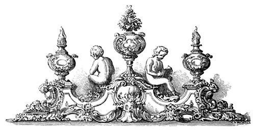
An inkstand showcased at The Great Exhibition of 1851, a celebration of the best manufacturing from around the world. The use of ornamentation here is extreme but not atypical.
Historically, handcrafted decoration has been expensive to produce, serving as a symbol of wealth and luxury. With the advent of mechanization, imitations of those same sought-after ornaments could be stamped out cheaply and quickly. Rather than stop and think about what sort of design would be best suited for mass production, manufacturers jumped at the opportunity to copy historicized styles at low cost. The result was the flood of garish, low-quality products that Adolf Loos, along with other pioneers of modern design, railed against.
In The Decorative Art of Today, famed architect Le Corbusier bluntly asserted that trash is abundantly decorated, and that, “The luxury object is well-made, neat and clean, pure and healthy, and its bareness reveals the quality of its manufacture. It is to industry that we owe the reversal in this state of affairs: a cast-iron stove overflowing with decoration costs less than a plain one; amidst the surging leaf patterns flaws in the casting cannot be seen.”
Montgomery Schuyler, an influential critic and journalist, condemned the heavily ornamented 19th-century facades, saying, “If you were to scrape down to the face of the main wall of the buildings of these streets, you would find that you had simply removed all the architecture, and that you had left the buildings as good as ever.”
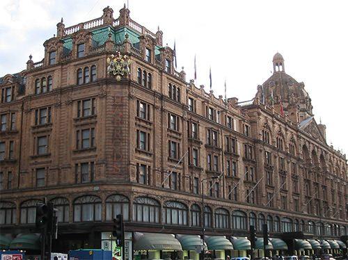
Harrods’ current building in London was completed in 1905 to the design of architect Charles William Stephens. The facade is typical of Victorian architecture. (Image: Michael Greifeneder)
Louis Sullivan, the architect known as “the father of skyscrapers,” called for restraint by suggesting, “It would be greatly for our aesthetic good, if we should refrain entirely from the use of ornament for a period of years, in order that our thought might concentrate acutely upon the production of buildings well formed and comely in the nude.” Below is an image of one of Sullivan’s buildings. The ground floor is decorated, but the upper floors are surprisingly modern for a 19th-century design, especially when contrasted with Harrods’.

Louis Sullivan’s Carson Pirie Scott store was originally designed in 1899 for Schlesinger & Mayer. The simplicity of the upper floors here is striking for a 19th-century building.
During the 1920s, a new movement emerged in Germany known as the untranslatable word Sachlichkeit, which has a sense of “factual,” “matter of fact,” “practical,” “objective.” The Neue Sachlichkeit movement in the field of design sought pure utility. German architect Hermann Muthesius explained how this idea of utility could be applied to style, to produce something he called Maschinenstil, or “machine style.” In his own words, we find examples of this style in “railway stations, exhibition halls, bridges, steamships, etc. Here we are faced with a severe and almost scientific Sachlichkeit, with abstinence from all outward decoration, and with shapes completely dictated by the purposes which they are meant to serve.”
Instead of attacking ornament, other pioneers of modern design focused on elevating functional form on a pedestal. In 1934, an exhibition curated by modernist architect Philip Johnson was held at New York’s Museum of Modern Art, titled Machine Art. On display were various pieces of mechanical equipment, such as airplane propellers and industrial insulators. The idea was to highlight beauty of form in objects that were purely functional. For the modern design movement, decoration was not necessary. Beauty and elegance were to emerge from the design of the content itself, not from a superficial coat of decoration.
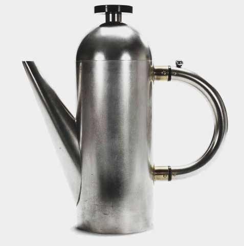
This teapot was designed by Naum Slutzky, goldsmith, industrial designer and master craftsman of Weimarer Bauhaus. The clean, utilitarian design has not a trace of ornament — an almost mathematical solution to the given problem.
It took much of the first half of the 20th century for the Modernist movement to prevail, but eventually traditional styles and techniques were surpassed by newer approaches. In his book Twentieth-Century Design, Jonathan Woodham notes that the Modern aesthetic was characterized by “clean, geometric forms, the use of modern materials such as chromium-plated steel and glass, and plain surfaces articulated by the abstract manipulation of light and shade. The use of color was often restrained, with an emphasis on white, off-white, grey, and black.” Modern design had shed its opulent coat of ornament and instead sought beauty in a harmonious fusion of form and function.
It would be wrong to suggest that the Modern design movement on the whole can be characterized as anti-ornamental. New styles came and went, such as the popular movements of Art Nouveau and Art Deco. Some styles, such as Futurism, pushed for an exaggerated technological aesthetic, while others, such as De Stijl, sought harmony in a limited palette of colors and shapes. But underlying the outward shifts in style was the steady movement away from needless ornament, a movement towards a cleaner, more restrained form of design whose beauty lay in the style and shape of the content itself, rather than in external decoration.
Digital Ornament
If we compare the history of modern design with our short history of software and Web design, a parallel can be seen. In the same way that mechanized mass production resulted in an overuse of ornament, so did advances in display and styling technology result in the heavy use of decoration in software interfaces and websites. Designers in the early years of the Web were especially explorative on this front, using animation and sound together with images to produce excessively rich and often garish experiences.
Early operating systems with graphical user interfaces were still fairly basic in their look and feel. Granted, real-world metaphors were used where they could be, such as for images of folders to denote file directories and buttons with bevels to let the user know they could click on them. But the overall aesthetic was fairly flat and restrained. Regardless of whether the designer wanted to deliver a richer visual experience, the low resolution of the black and white displays limited them.
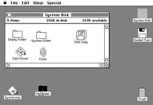
Using only two colors for the first Mac OS graphical interface, Apple managed to convey depth, textures, buttons and icons that mimicked real-life objects. The appearance of the interface was constrained by technology, rather than by the designer.
As technology evolved, designers were granted greater visual freedom with their interfaces. With Windows XP, Microsoft introduced a colorful style throughout, giving it a somewhat physical appearance, with plenty of highlights, shadows and gradients.
Apple went even further with the release of Mac OS X, styling the interface with shiny plastic bubbles, brushed aluminum and lifelike icons. As time went by, the visual styling of operating systems grew in intensity. Microsoft gave Windows a shiny, transparent glass-like theme, while Apple introduced even more materials and skeuomorphic cues into its desktop and mobile systems, such as leather textures in its calendar app and realistic page-turning effects in its book reader.

The Windows Vista interface featured the Aero theme, with its shiny, glass-like window chrome.
Styles that imitate real-life objects and textures are said to be “skeuomorphs” — that is, design elements based on symbols borrowed from the real world, for the sole purpose of making an interface look familiar to the user. Recently, designers have started questioning the logic of styling a notes app as a paper pad, or of adding leather and page-turning effects to a calendar app. These effects provide visual interest, but they are also relics of another time, relics that tie an interface to static real-life objects that are incompatible with the fluidity and dynamism of digital interfaces.

The current version of OS X’s calendar features a stitched leather texture and torn paper edges to give the appearance of a physical calendar.
With the latest release of Windows 8, Microsoft took a brave step away from such superfluous visuals, attempting to give its operating system a wholly digital and, in its words, “authentic” look. The latest interface is built upon the principles that Microsoft developed for its earlier mobile release, presenting the user with an aesthetic that is almost wholly devoid of textures or imitations of real-life objects.
Instead, Windows 8 relies on typography, spacing and color to bring order and elegance to the digital canvas. Real-life effects and superfluous styles are discarded, and all that is left is simply the content itself. Much as Muthesius once submitted railway stations as examples of Maschinenstil, the designers at Microsoft point to examples of railway station signs as inspiration for the new Windows interface, previously known as “Metro.”
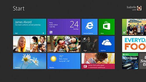
Windows 8’s start screen breaks away from the old desktop design, being composed of flat, colorful live tiles, instead of icons. The tiles are not merely a stylistic choice: They allow useful information to be displayed on the start screen in the manner of a dashboard.
The Web has seen a similar transformation over the years. Early table-based and Flash-based designs gave developers pixel-perfect control over their interfaces, and so designers did not hesitate to create visually rich containers for their content. As we began to grasp the fluidity of the new medium and to disconnect presentation from content using CSS, Web design became more restrained. Highly decorated containers could not change their width and positions easily, so designers used fewer images and relied more on simpler CSS styling to make their layouts more adaptive and easier to maintain.
The latest evolution of responsive design (which is to adapt a single page to suit various screen sizes and devices) as well as the move among designers to work directly in code from the start, skipping visual editors such as Photoshop, moves us even further towards a simpler, content-focused Web aesthetic, one that derives its beauty from typography, spacing and color rather than from a heavy use of textures and decorative images.
Most recently, Apple, the leader of skeuomorphism, has taken its first step towards digital authenticity with the latest release of its mobile operating system, iOS 7. Gone are the stitched leather textures and ripped paper edges, replaced by a minimalist, mostly flat interface, with colorful, simplified icons and semi-translucent surfaces.
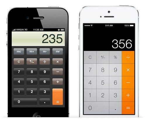
Apple’s iOS 7 is a radical turn away from skeuomorphism. The old design of iOS’ Calculator app is on the left, and the one for iOS 7 is on the right. The grainy texture, bevelled buttons and shiny glass are all gone, replaced by a mostly flat, functional interface.
Authentic Design
What ties the pioneering days of Modern design to the current shift in software and Web design is the desire for authenticity. This drive towards greater authenticity is what moved designers to scrape away ornament from their work over a hundred years ago, and this force is what is moving digital design today towards a cleaner, more functional aesthetic. But what exactly makes design “authentic”?
Authentic design aims to pierce through falsehood and do away with superfluousness. Authentic design is about using materials without masking them in fake textures, showcasing their strengths instead of trying to hide their weaknesses. Authentic design is about doing away with features that are included only to make a product appear familiar or desirable but that otherwise serve no purpose. Authentic design is about representing function in its most optimal form, about having a conviction in elegance through efficiency. Authentic design is about dropping the crutches of external ornament and finding beauty in pure content.
In authentic design, style is not unimportant, but it is not pursued through decoration. Rather, beauty of form depends on the content, with the style being a natural outcome of a creative solution. As Deyan Sudjic commented on the design of the iconic Anglepoise lamp, “How the lamp looks — in particular the form of its shade — was something of an afterthought. But that was part of its appeal. Its artless shape gave it a certain naive innocence that suggested authenticity, just as the early versions of the Land Rover had the kind of credibility that comes with a design based on a technically ingenious idea rather than the desire to create a seductive consumer product.”
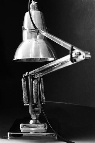
The design of the Anglepoise lamp is an ingenious solution to a real problem. But the resulting form, which is an effective solution, turns out to have its own aesthetic allure.
In digital design, authenticity means a few things, which can roughly be summarized as the following:
- Embrace the digital look.. We do not have to mimic textures such as metal, wood and leather on a computer display. They are not what a digital interface is made of, so pretending that it is makes no sense. This does not mean that a design should have only plain flat backgrounds colors — rather, it means we should not try to imitate or be restricted by textures from the real world.
- Do away with skeuomorphism.. A digital book need not imitate physical paper as one turns the page, nor does a note-taking app need to look like a physical paper pad, with a leather cover, torn edges and a handwriting-styled font. Skeuomorphism is not always bad, but it always introduces needless constraints on the interface. For example, while a paper pad is static and one dimensional, a digital interface need not be; but as long as the interface is made to imitate a paper pad, it has to bear the constraints of the physical metaphor.
- Make the style content-centered.. Focus on the content rather than on its styling and decoration. You might think this point is trite, but how many times have you seen an off-the-shelf theme on a website? A theme is always built on dummy content and so, by its very nature, could never be an optimal representation of the content it will eventually hold. Building themes with dummy text pushes the designer to focus on styling and decoration, rather than on content, because there is no content yet to work with. Only when you work with real content can you begin to truly transform function into form.
NOT MINIMALISM
Design whose beauty lies in function is not the same thing as minimalism minimalist style. With the former, the designer seeks to remove the superfluous, to make the product easier to understand, to make it perform better and to make the most of its medium. The latter seeks to create a minimalist aesthetic, to give the object an aura of simplicity and cleanliness. One is a fundamental principle of design, the other a stylistic choice.
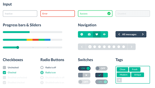
The Flat UI theme kit, by Designmodo, is an outward representation of the underlying shift towards authentic design. But as a style, “flat” is a choice, not a necessity.
It would be a mistake to rigidly apply a minimalist design aesthetic to an interface as a style in the hope of making the interface simpler and more digitally “authentic.” For example, ruthlessly eliminating visuals such as shadows, colors and varied background styles would not necessarily make an interface easier to use. In some cases, it would achieve the opposite by undermining hierarchy and focus, which were established by those very shadows and background colors.
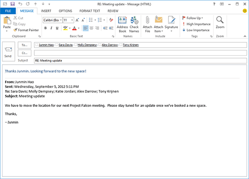
Outlook 2013’s interface was updated to fit Windows 8’s modern theme. But with the interface being flattened, all of the content and menus were merged onto a single white plane, becoming more cluttered as a result.
In The Laws of Simplicity John Maeda posits, “The simplest way to achieve simplicity is through thoughtful reduction. When in doubt, just remove. But be careful of what you remove.” The final warning is important. Removing things often leads to simplicity merely because the user has fewer items to process. But removing visual cues that help the user mentally process the interface — such as graphical elements that group items, that differentiate buttons and labels and that make things stand out — could do exactly the opposite by giving the user more work to do. So, rather than guide the design by style, guide it by principle.
WHY AUTHENTIC DESIGN MATTERS
The Rise app is a perfect example of digitally authentic design. The alarm clock is a problem that has already been solved, but Simplebots decided to tackle the concept from scratch, rethinking the interface in the context of a purely digital canvas.

In the Rise app, the user sets the time with an innovative full-screen slider, with the background color changing to reflect the color of the sky.
Rise’s interface features a full-screen slider, with a background color that changes to reflect the color of the sky at the time you’ve set. It shows no attempt to mimic a physical clock or a physical slider or real-life textures. Instead, the designers have fully embraced the touch canvas of the mobile phone, creating an experience that is designed from the ground up to make the most of its medium. The innovative design not only makes for a great user experience, but elevates the app above others in the marketplace.
An interface like Rise’s is only possible when you tackle a design problem wholly within the context of the digital canvas, rather than by translating solutions from the real world. The digital screen allows for abstract forms, animation, bright colors and uniform shades. It need not be limited to a subdued palette or static representation, nor must it be bound to skeuomorphic forms. By figuring out how best to represent content using the pixel grid, we can arrive at better, simpler solutions, innovative interfaces that feel at home on the screen, designs that provide a better user experience and that stand out from the crowd.
The recently popularized “flat” design style may be a trend, but it is also the manifestation of a desire for greater authenticity in design, a desire to curb superfluous decoration and to focus on the content itself. Technological progress sometimes leads to excess, as mechanized mass production did in the 19th century when ornament became overused, and as display and styling technologies did during the early years of Web and software design. But ornamental excess was curbed over time by the pioneers of Modernism, who sought beauty in function, and today’s excesses in software will in time be curbed by an underlying desire for authenticity in design.
REFERENCES
Bauhaus, Frank Whitford (2010: Thames & Hudson)
Twentieth-Century Design, Jonathan M. Woodham (1997: Oxford University Press)
Pioneers of Modern Design, Nikolaus Pevsner (1991: Penguin Books)
The Language of Things, Deyan Sudjic (2009: Penguin Books)
The Laws of Simplicity, John Maeda (2006: MIT Press)
Authentic Design