Quick summary ~~> The layout is the foundation of your website. It guides the user through the sections and tells them what is most important. It also sets the aesthetic of the website. Therefore, you need to carefully think through how you lay out content.
The layout is the foundation of your website. It guides the user through the sections and tells them what is most important. It also sets the aesthetic of the website. Therefore, you need to carefully think through how you lay out content.
An original, creative layout goes a long way to improving the user experience of a website, although not letting your creativity get in the way of usability is important. As usual, we have to put ourselves in the users’ shoes: What do we want them to see first? How will your message be best communicated? We have to ask these questions before we start designing, because the layout will shape the rest of the design.
Well, the following websites have some quite… unusual layouts. They aren’t necessarily perfect; still, browse through them, and maybe, just maybe, your creative genius will be sparked.
Original Web Layouts
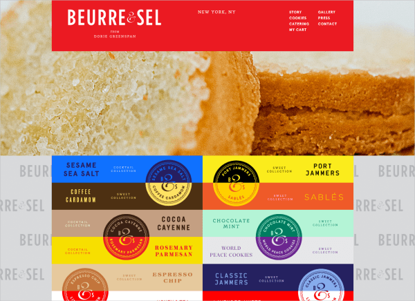
Beurre & Sel This website is just beautiful. The automatic slideshow plays in the background, with the main navigation bar at the top. As you scroll down, the navigation shrinks but remains fixed at the top. Below is a colorful list of the different cookies the company makes, but these also serve as buttons in a submenu. When you click on a flavor, information overlaps this submenu, allowing you to click through the assortment of cookie flavors. The navigation bar at the top and the submenu are confined to the middle column of a three-column grid, maintaining the user’s focus at the center.
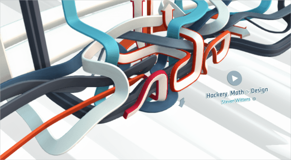
As the page loads, a fun 3D line animation starts to fill the screen. The arrows indicate movement and fluidity and encourage the user to scroll down toward the content. The content below is laid out in a three column grid with two main columns and one smaller side bar. However, it doesn’t feel boxy and constrained but has a more open feel — this is due to the ample space given and the use of rounded corners. The layout of this site is comfortable for the user.
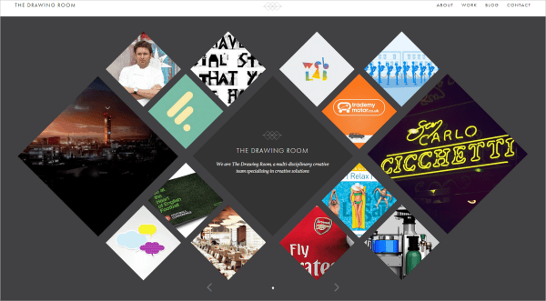
I love this layout, simple yet so visually interesting. The studio’s work is displayed in diamond shapes of different sizes that fit together. The center diamond is the nameplate, which isn’t too prominent and so doesn’t detract from the work. As you hover over a diamond, it fills with a description of the work. This single-page website has an original and clean layout that it easy to use.
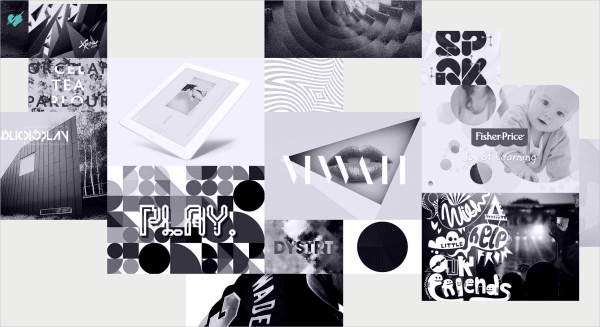
Luke Finch’s portfolio has a fun and friendly layout. The work seems to be haphazardly scattered, breaking away from too clean and predictable an approach. The transitions tell you a bit about the projects, and you can navigate using the arrows. The little heart in the top-left corner is the navigation for the whole website, it swivels into an “i” on the home page. When viewing a project, you can exit by hovering over the heart.
This layout is dynamic. Upon loading, it greets you with a quirky photograph and prompts you to scroll down, where the navigation appears and eventually affixes to the top. I really like the transparent navigation bar, which opens the page up a little, revealing the content underneath. The content is scattered around the page, although the website does have structure; each section is set off by a different background color. The projects are prominently displayed in a three-column grid, but the section for the team members breaks away from the grid and uses the space in an interesting way.
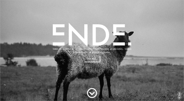
How’s about some color? This portfolio website has some serious personality, and the work is loud and lively as it moves about. Most effective is the consistency in style. The website coheres as a complete work, representing the designer while supporting the individual portfolio pieces — which is precisely what such a website should do. The color palette is incorporated in the nameplate, and the flashing animation brings energy to the website.
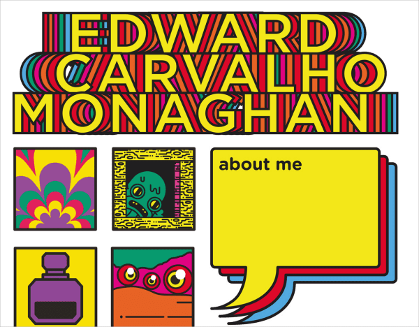
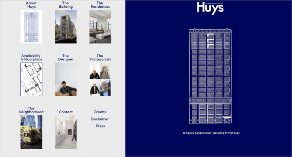
This site has an original take on layout with the right side of the page acting like a kind of letterhead, providing all the necessary information like who they are and what they do. The left side of the page scrolls vertically and resembles the layout of the windows of the condominiums they build. Once you click, you are directed to a more blog-style layout which is easy to navigate.
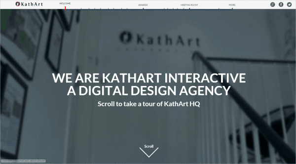
KathArt has a great video layout. The personality just about oozes from this simple yet highly effective design, as you meet the members of this team. The team members are introduced as they’re working, as though you’re in the office with them! The navigation as a timeline is clever because you can track the progress of the video easily.
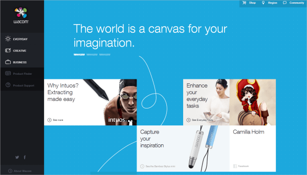
Wacom targets a wide audience of both professional and non-professional creatives with its website. The layout is an integral part of this and creates a user-friendly experience. The navigation on the left minimizes when hovered over, and it shows the various categories available. The user is in control and can choose which products to look at; they are not coerced or subjected to a sales pitch. The layout of the home page is simple and guides the user to the product that best suits their needs. I like the subtle hand-drawn elements that accompany the products.
The layout here really helps to showcase the attitude and spirit of this event. The navigation runs down the left side, becoming a reference point across the website. A slideshow of strong, visually stimulating images rotates, with teasers for the event’s festival, playground and conference. This is an effective way to engage users.
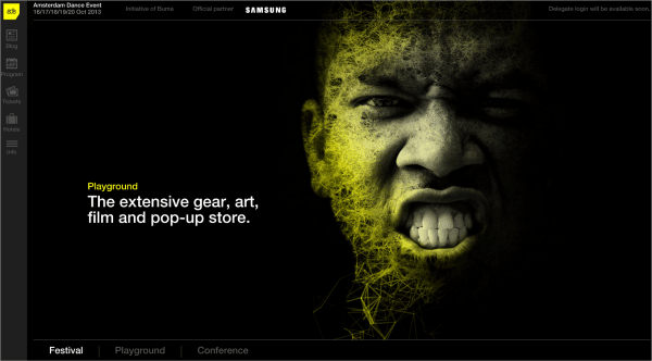
As you scroll down the page, the content below slides over the slideshow, bringing the submenu from the bottom to the top. Each section of the website has a banner that runs across the screen, making for a visually appealing introduction to that section. The rest of the articles are laid out in a grid. The rows in the grid don’t line up perfectly; each column starts slightly lower than the last — another small yet effective visual device.
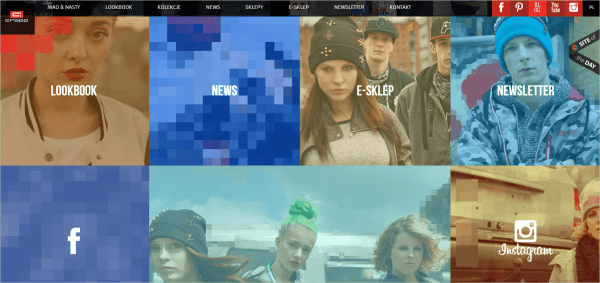
Cropp has a big and bold personality, and the layout showcases it. As you hover over an image, the image pixelates beyond recognition, which grabs your attention. The navigation bar at the top is consistent across all pages, and the home page is basically a loud, visual representation of the options in the navigation. The layout captures the idea of pixellation, and all photographs and videos are laid out in blocks, like a pixelated image.
The grid layout for Davy Rudolph’s portfolio is simple and minimalist — pretty straightforward and natural to the user. Each page has only two colors, unique to that page. When you click on one of his projects, the showcase takes precedence, and the main navigation panel disappears. What I like about this approach to a portfolio website is that, while it has personality, the personality does not detract from the designer’s work.

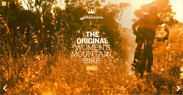
Juliana has a rather unusual and innovative design for a bicycle store. Upon loading, a beautiful photograph fills the screen with richness and warmth. The website is laid out in four sections, which are kept hidden behind the navigation icon. The design seems to have a more feminine touch, and the typography is bold and strong with a bit of flair. The 3-D hover effect on the bicycles is a nice touch as well.
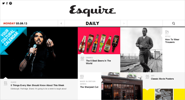
The layout here is simple, clean and accessible. Esquire’s identity is a monochromatic black and white. The article teasers are in color, drawing the reader’s eye. The hover effect is also simple, with a description below the teaser caption. The navigation is in the middle of the website, functioning much like a newspaper, where the reader becomes intrigued by the content above the fold. The images, color and brief headlines grab the user’s attention.
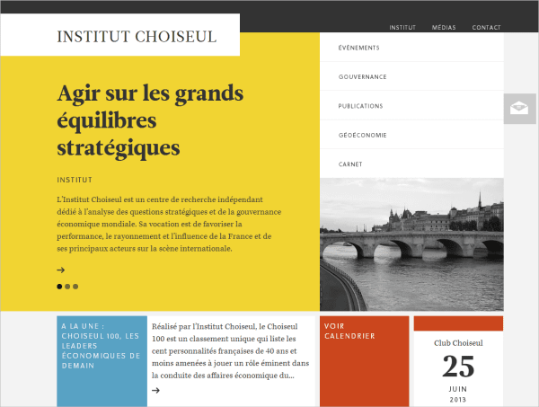
Intitut Choiseul has an attractive block layout that fits together like a puzzle. The layered look with the slabs of color help to establish the identity. Further down the page, the layout transitions to a more traditional grid, although each story is in a different-sized block, creating an interesting and dynamic aesthetic. The different blocks of color set off the different parts of the website, making it easy to navigate and read. The website has a sophisticated and refined quality, suited to its purpose.
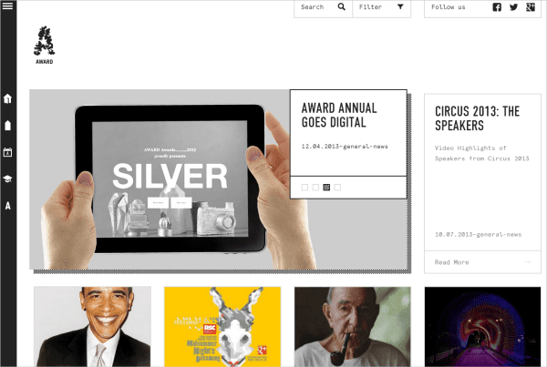
Award celebrates creativity, and its neutral design aesthetic sets the stage for the designers’ work effectively. The grid layout doesn’t have any trim or frills that would detract or clash with any of the designs being featured, but the interesting hover effect has a nice pixelated drop-shadow. The navigation is fixed to the left of the page, and the search and filter functions are fixed at the top. This navigational arrangement is best suited to showcase the contents of the website.
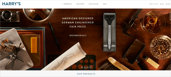
The experience of this website is lovely. The designers make great use of the grid, which has a classic appeal appropriate to the target market. The open, clean, structured design makes for a pleasant user experience. Being a website that sells men’s razors, Harry’s features images that are sophisticated and manly without feeling brutish.
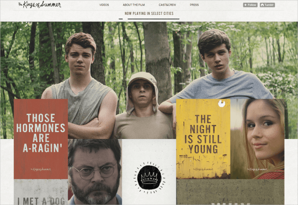
This Tumblr website conveys the charm of this movie with the layout of photographs, the occasional GIF, and quirky lines from the movie. It has a structured yet not uniform layout that is fun to scroll through, and the handwritten type for the title helps to establish a scrap-book feel. The unique arrangement of content blocks creates an interesting visual, with pictures and GIFs overlapping every now and then, guiding the user’s eye around the website. A movie website should convey the complex personality of a feature-length film, and although I haven’t seen this movie, I definitely have an idea of its personality.
World Baking Day The layout of World Baking Day requires interaction of the user right from the get-go. As the page loads, you are prompted by an animated hand-drawn arrow to choose your baking level. If you choose to view all recipes across all levels, instead of one at a time, then you’ll be greeted with an entire screen full of delicious, mouth-watering recipes.
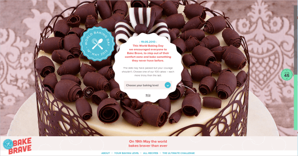
The layout treats food like a work of art, showcasing photographs of the baked goods on most of the page and redirecting you to another page for the recipe itself. The recipes are neatly laid out in three columns: ingredients on the left, instructions in the middle, and information about the contributor on the right.
The layout and interaction of Paper & Paint is original. As you navigate, the website almost snaps from section to section, and the layout and structure are appropriate to the product. The navigation is hidden and appears when you select a color scheme. The images are prominently displayed as you scroll through, and the top of each subsequent image teases the user, inviting them to scroll to see more.
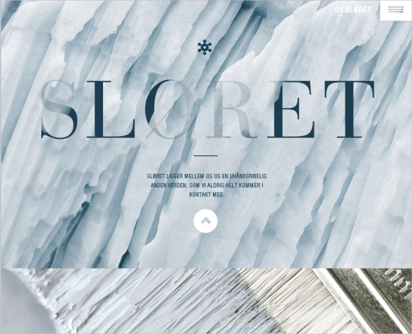
I love the way the images move inward as you scroll down the page, making for an interesting visual dynamic. Another nice interactive feature is “painting” the wall different colors using your mouse, which adds a bit of fun.
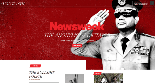
This layout is anything but conventional for a news website. The home page of Newsweek is simple yet bold, with the photograph for the lead story set as the background image. The small red tabs throughout signpost the website, indicating the types of stories being featured. The layout is broken up into sections that don’t all follow the same grid. The “Newsmakers” section makes use of a standard grid but breaks away from the conventional table look, with some of the images appearing as circles, instead of the usual squares. As you scroll down, the same pattern for each day’s news is laid out in this way, which creates a consistency that is easily understood by the reader.
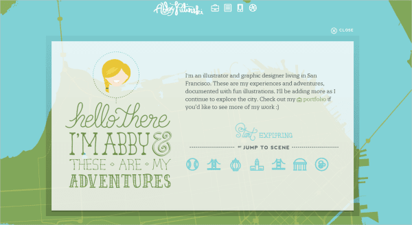
An original approach to a portfolio site, Abby Putinski seperates herself as a creative illustrator and graphic designer. Upon loading, an animated introductory window falls onto the screen inviting the user to explore her work. Once you close the window you move around a map compiling all her adventures. This site doesn’t really have a layout and is free and open with no clear boudaries, making it so interesting to navigate. When you click on a work, the image in a postcard-type frame falls onto the page, reiterating the idea of adventure and travel. The navigation is always available and fixed to the top in the same illustrative aestheic.
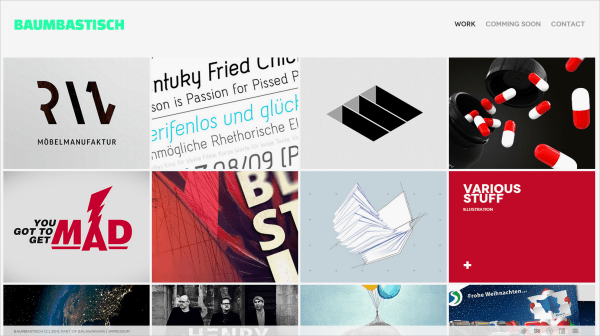
This tight grid layout is a nice way to showcase a portfolio of work. When you hover over each piece, the title is given but when you click on a work, a “front page” for the work appears. This page provides all the necessary information about the project, such the date, the client, the desinger’s role etc. which is consistent throughout all the projects. You have to click through a slideshow that fills the screen to view the project. I think it’s a really effective way to showcase work.
The strong photography and beautiful images do a great job of showcasing the artistic talent at this university right from the start. The background image on the home page tells a story, drawing the user in. I like the layout of the navigation to the side; it is different but works well and doesn’t overpower the image or layout. The labels are all yellow, creating a consistent visual identity. The drop-down menus take prominence when a category is clicked, which the layout accommodates well.
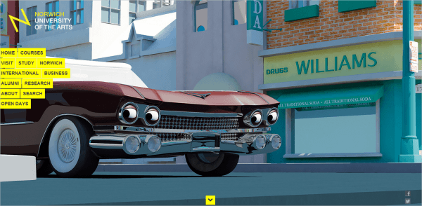
The logo also caught my attention, with its neat Helvetica lettering. It isn’t overpowering, but the tilt of the “N” adds something different, a little spunk. Our first impression is established by the large background image, but then an arrow invites us to scroll down to view the various stories, which are featured as large thumbnails with captions. The rest of the page is fairly conventional.
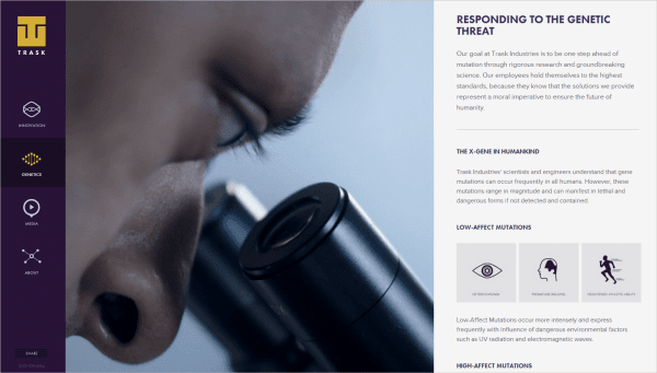
Trask Industries is a viral website for the new X-Men movie. The layout is simple but effective. It is divided into three parts, with the navigation sidebar fixed to the left, a video in the center, and the main content scrolling vertically on the right. The video used here works well to create anticipation for the movie. The animated hover effect in the navigation icons is a nice touch. The point of the website is clear, as demonstrated by the prominence given to the video. The transitions are rather nifty, as the content sections slide out and back in. Also, try resizing your browser to see how the layout changes — the navigation is hidden, with the content visible as you scroll down the page.
This website is really interesting for its seeming lack of layout. It is created with Flash-like animated typography that continues to autoplay throughout the website. Even without clicking through the various categories, the user gets an idea of the designer’s work through the animated slideshow. The animation is consistent, and the illustrations are cute and do a great job of illustrating the designer’s creative personality.
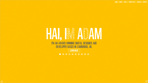
Everything here — the CSS, HTML, JavaScript and SVGs — animates as you scroll. It’s crazy! The bright colors are stimulating, and the design is made up of intricate illustrations. The downside is that the website was developed only for desktop computers with a mouse, and it works only in Chrome.
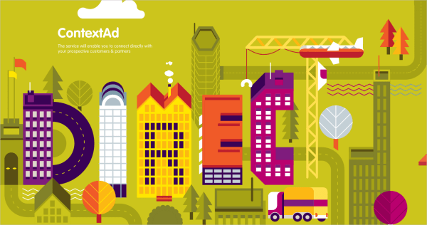
This layout has a layered feel, exhibiting a modular approach. The different elements on the page seem to overlap one another; for instance, the navigation bar stops about three fourths of the way across the page. The photograph lies below the navigation, and the buttons and captions are written in colored blocks, adding to the modular layering aesthetic. I also like the drop-shadow effect with the drop-down menus in the navigation, which creates an interesting depth.
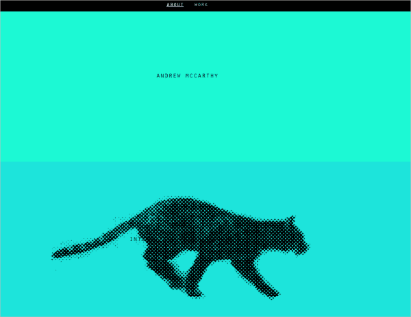
Andrew McCarthy’s portfolio has a unique layout. Bands of color wash the page, and more information about the designer is revealed as you scroll down. A clever stop-motion graphic of a pixelated feline runs in place as you scroll. I love the movement created by this simple idea. Incidentally, the website also relies on the interaction of the user.
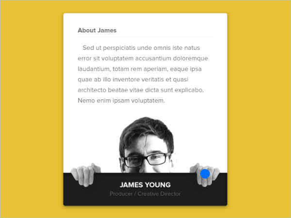
Animation, when used wisely, can really contribute to the functionality of a website. Mikael Edwards uses animation that is both visually appealing and functional. We’re designing for the Web, right? There is no need to squash everything onto the page or wrap text around images. Why not include interactive animation and make it fun? This idea works well here as a hover effect. The blue dot represents the cursor; as you move the mouse in, the image shifts, making space for the text.
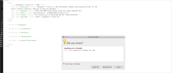
Not quite what you were expecting from a designer’s website, right? Designer’s Friend looks like the HTML code behind the website itself. Everything you need to know is right there in the code, with the tags acting as headings. The “Tip of the Day” box is a wonderful device that guides the user through the website.
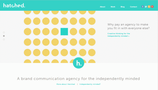
The layout for Hatched is anchored by the navigation and sections that run wide across the screen, creating a boldness and openness. The responsive navigation is interesting. On a smaller screen, it could look clumsy; but here, the navigation, including the social network buttons, is kept to one menu button.
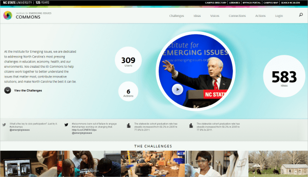
This website has nice consistent transitions, with the circles popping up as the page loads. The website is well structured, and the circles create a friendly counterpoint to the statistics below. The captions in the “Challenges” section look like speech bubbles, adding to the friendly atmosphere. The hover effect on these captions is visually appealing as well as functional. The user is not bombarded with statistics because the numbers are hidden and revealed only when hovered over.
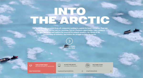
The layout of Into the Arctic engages the user and incorporates their interaction. The video in the background captivates the user and illustrates its cause. The style of the navigation is different — as you hover over it, it folds out with more information, like a pamphlet. The typography is also alluring, and the pull quotes are particularly strong. The design of the website is just really well executed.
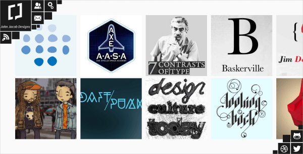
This portfolio has horizontal scrolling, which is very unusual. When you click to view a work, it unfolds to the middle of the screen, with an enlarged view and a short explanation of the work. The descriptions and list of work are short and concise; you don’t feel like you’re constantly being redirected to other pages. I really like the navigation, clustered in the top-left corner with the designer’s social network links in the bottom-right corner, framing the page. The designer uses the space effectively, and the swivel effect is interesting.
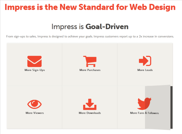
The white space here is refreshing and creates an openness and friendliness. White space allows the user to read and navigate comfortably and to use the website effectively. The hover effect is different; it is as though half the paper folds up. When clicked, the button folds over like a book to reveal more information.
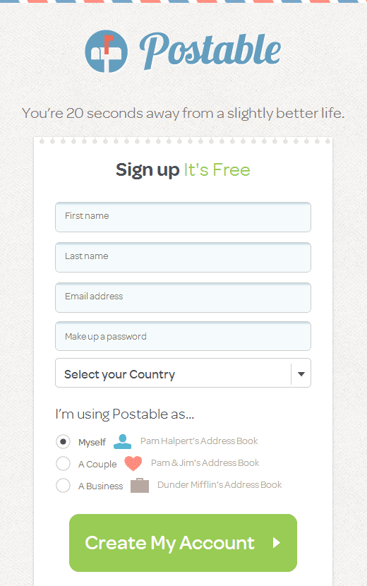
Postable has a cute concept; it sends beautifully designed thank-you cards by email for you, and the design of the website has a real snail-mail look. The design and layout throughout play an integral part in communicating the concept. The background has a real paper texture, with a top border resembling an old-school envelope. The authentic real-life feel is a lovely touch on the Web form, as though you’re scribbling your information on a sheet in a notebook.
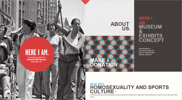
National LGBT Museum This website has a new take on single-page layouts. The scrolling mechanism here is really cool; the page splits in half, with the two halves scrolling in different directions, creating a dynamic effect. The sections are in different colors and snap together as you scroll.
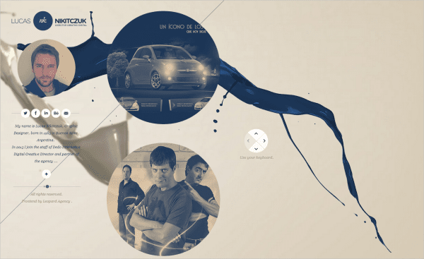
I really like the layout of Lucas Nikitczuk’s portfolio because it showcases his skill. It gets straight to the point, with a short biography of the designer and his work right there on the home page. The circles create a friendly and fluid aesthetic. The paint spills in the background add to this and create an openness and freeness to the website’s identity. The navigation is pretty simple and works the same throughout the website. Another nice touch is that you can navigate with the arrow keys, which is helpful for laptop users.
Conclusion
The layout is the foundation of your website and a crucial part of any creative endeavor. Consider the user and how they will interact with the website. Will they likely be viewing your website only on a mobile device? How would that affect the layout? I hope you’ve gleaned some inspiration to tackle some layout designs yourself!
Original And Innovative Web Layouts